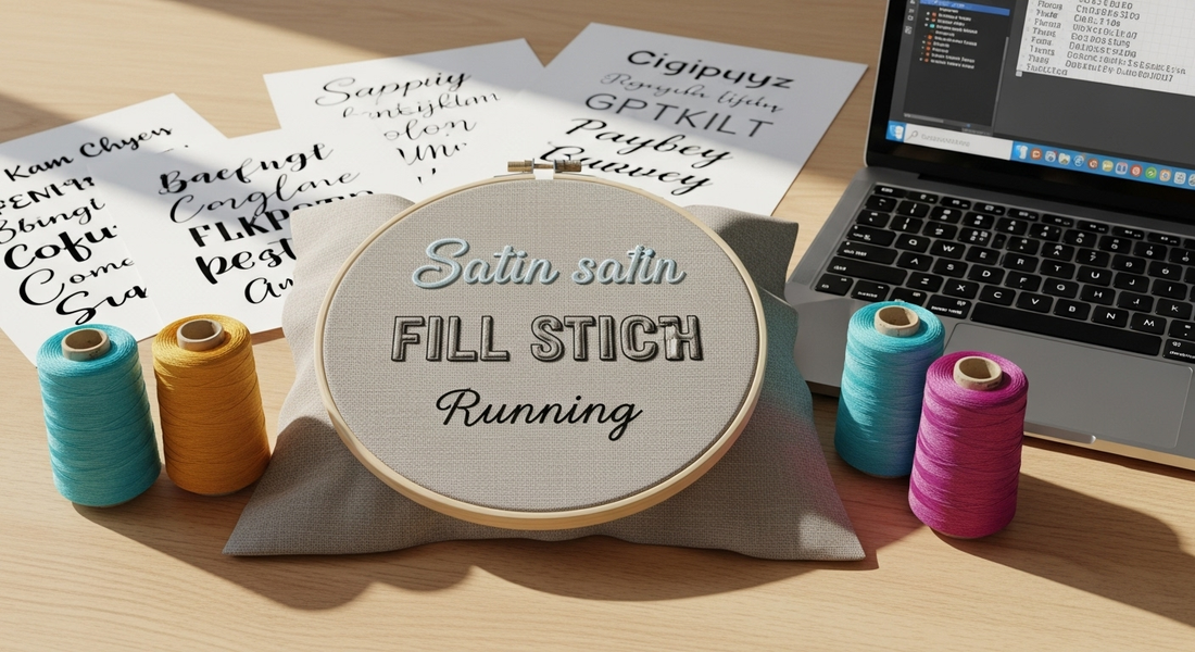
Typography in Embroidery: Why Your Pretty Font Might Be a Total Disaster
Share
Whether it's a name on a towel, a company logo, or some meaningful quote on a jacket - text is everywhere in embroidery. But here's the thing nobody tells you: just because a font looks amazing on your screen doesn't mean it'll stitch well on fabric.
I learned this the hard way when I tried to embroider my friend's business name in this gorgeous script font. On my computer it looked elegant and professional. Stitched out? It looked like someone had sneezed thread onto fabric. You literally couldn't read half the letters.
Embroidered text has its own rules, and they're pretty different from regular graphic design.

Fonts That Actually Work (And the Ones That Don't)
Some fonts are perfect for print but fall apart completely when stitched. Think of embroidery-friendly fonts as the ones that are bold, simple, and easy to read from across the room.
What works:
- Clean sans-serifs like Arial or Century Gothic
- Solid block fonts like Impact or Franklin Gothic
- Rounded scripts like Pacifico (as long as they're not too thin)
What doesn't work (trust me on this):
- Skinny cursive styles that look like spiderwebs when stitched
- Fancy serif fonts with tons of little details that just turn into mush
- Handwritten or distressed fonts with uneven edges
Pro tip: Many embroidery programs come with fonts made specifically for stitching. Use them. They'll save you so much time and frustration.

Size Matters More Than You Think
A huge issue with lettering is size. A font that looks crisp on your computer can become completely unreadable if it's too small in stitches.
Here's what I've learned through trial and error:
- Satin stitch: Don't go smaller than 6mm high or it gets messy
- Fill stitch: Need at least 10mm or more, otherwise it's just a blob
- Running stitch: Can go as small as 3-5mm and still look decent
Planning to go tiny? Stick with running stitch. Going big? Be ready to adjust density so the fabric doesn't bunch up like a accordion.
Give Your Letters Some Space to Breathe
Thread behaves differently from ink. It has weight, it has tension, it pulls on stuff. If letters are too close together, they'll blend into each other or end up looking squished.
Here's what actually helps:
- Add a bit of extra space between letters (more than you think you need)
- Keep word spacing loose enough to stay readable
- Avoid overlapping unless that's part of the style (like in cursive)
I used to think loose spacing looked unprofessional. Now I know it's the difference between readable text and expensive-looking garbage.
Match Your Stitch to Your Font
Different fonts call for different types of stitches, and getting this wrong can ruin everything.
- Satin stitch: Best for bold, mid-sized lettering. Clean and raised, looks professional
- Running stitch: Perfect for small, subtle text. Light and precise, doesn't distort fabric
- Fill stitch: Great for large logos or block fonts. Gives texture but can feel heavy

Think About Where You're Putting It
Text draws the eye whether you want it to or not. Where you place it matters way more than you'd think.
- Center it across a chest or back for classic placement
- Arch it for a badge or circular patch
- Try vertical layouts for sleeves or unique placements
Use alignment tools to make sure everything sits right. Nothing looks more amateur than slightly crooked text.
Test Everything (Seriously, Everything)
No matter how good a design looks on screen, do a test run on a scrap piece of fabric. Ideally the same kind you'll use in your final piece.
Check for:
- Can you actually read it?
- Does the spacing look balanced?
- Are the edges clean or fuzzy?
Tweak as needed. Testing once can save you from having to fix mistakes later, and trust me, picking out embroidered text is not fun.
What I've Figured Out
Good embroidered text doesn't just look nice - it reads clearly, holds its shape, and actually adds something to the design instead of distracting from it. With the right font, size, spacing, and stitch type, you can bring any message to life in thread.
The key is understanding that embroidery typography is its own thing. It's not print design, it's not web design, it's embroidery design. Once you get that, everything else starts to make sense.
And once you find your go-to combinations that work reliably, you'll start building a style that's actually your own instead of just copying what looks good in magazines.