Color Theory in Embroidery: What I Wish Someone Had Told Me
So my neighbor Sarah comes over last week with this embroidery she's been working on. The stitching? Absolutely perfect. But something was just... wrong. Took me a few minutes to figure out what was bugging me about it - her colors were basically having a fight with each other instead of playing nice.
God, it reminded me of my own disasters when I first started. There was this one project where I thought, hey, bright pink on red fabric will look fun! What I got was this hot mess where you couldn't even see what I was trying to make. But honestly? That terrible project taught me more about color than any YouTube tutorial ever did.

The Color Wheel Thing (Yeah, I Know)
Look, I get it. Talking about color wheels sounds like we're back in third grade art class. But here's the thing - this stuff actually matters when you're trying to figure out why some colors look amazing together and others make your eyes want to cry.
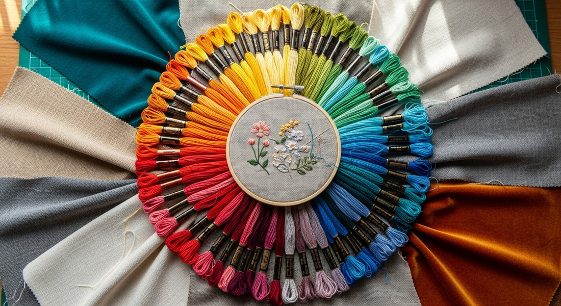
You've got your basics - red, blue, yellow. Mix them around and you get green, orange, purple. Keep going and you end up with all these in-between colors. The important part is where they sit next to each other, because that tells you how they're going to behave in your actual embroidery.
What Works and What Doesn't (From Someone Who's Failed A LOT)
Colors that want to fight each other Put red and green together and they're going to demand attention - sometimes way too much attention. These opposite colors create this visual tension that can be perfect when you want something to really pop. But mess it up and your embroidery looks like Christmas exploded.
Colors that are basically best friends The ones sitting next to each other on the wheel just get along. Blue melting into teal melting into green gives you this peaceful, cohesive thing. I use these when I want something that feels put-together without being boring.
The "let's try three colors" approach Sometimes you want some variety without total chaos. Pick three colors that are spaced out evenly around the wheel and you'll get something balanced but still interesting. It's like having a conversation with three people instead of just two - more dynamic but not overwhelming.

Thread Type Changes Everything (And Nobody Warns You About This)
Here's what I wish someone had told me: the exact same color can look completely different depending on what the thread is made of.
Rayon thread is like that friend who's always dressed up - shiny, catches light, makes everything look more dramatic. Polyester is more practical, lasts longer, but doesn't have quite the same wow factor. Cotton thread is reliable - looks natural, has this soft matte thing going on that's great for vintage projects.
And metallic thread? Beautiful but also kind of a pain. It looks different depending on the angle and lighting, which can be exactly what you want or completely mess up your whole design.
Your Fabric Isn't Just Background
I used to pick thread colors first and worry about fabric later. Big mistake. Your fabric is part of the whole color story, not just something to stitch on.
White or beige fabric is like a blank canvas - you can use pretty much any thread color and it'll work. Dark fabrics make light threads really pop (I love bright yellow or white on navy). But colored fabric? That's where it gets tricky. You have to think about how your thread colors are going to mix with that background color.
The Lighting Thing That'll Drive You Crazy
This is something nobody talks about enough: thread colors look different under different lights. That gorgeous purple that looks perfect under your craft room lights might look completely different in daylight. I learned this the hard way when I finished a project under artificial light and took it outside the next day - looked like a totally different piece.
Now I always check my colors under different lighting before I commit. It's saved me from some real disasters.

Keep It Simple (Most of the Time)
When I first started, I thought using tons of colors would make my work look more impressive. It just looked messy. These days I stick to maybe 3-5 colors for most projects. Easier to manage and usually looks more professional.
But sometimes you want messy. Sometimes you want to use every color in your thread box. Just make sure you're doing it on purpose.
The Practical Stuff That Actually Matters
Get yourself real thread charts - not the ones online, actual physical samples from companies like Madeira or Isacord. Screen colors lie. Printer colors lie. The only way to know what a thread really looks like is to see it yourself.
I keep this little notebook with thread samples from projects I've actually done. It's ugly but incredibly useful when I'm trying to remember what worked and what didn't.
What I've Figured Out
Color in embroidery isn't about following rules perfectly - it's about understanding how colors work together so you can make better choices. Sometimes the "wrong" color combination is exactly what makes a piece special. But you have to know the rules before you can break them effectively.
The biggest thing? Trust your eyes, but also trust your experience. If something looks off, it probably is. Don't be afraid to rip out stitches and try a different color. I've spent more time picking colors than actually stitching, but that's part of the process.
Every embroiderer has color disasters. The trick is learning from them instead of just being frustrated. That bright pink on red I mentioned? It taught me more about contrast than any textbook ever could.
Color theory gives you the foundation, but your instincts and personal style are what make your work yours.