Choosing the Right Stitch Types for Design Elements
I ruined a perfectly good polo shirt last month because I used the wrong stitch type. It was supposed to be a simple company logo – just text and a small icon. But I got lazy and used fill stitches for everything, including the tiny letters. The result? The text looked like a blob of thread, and the shirt ended up in my "learning experiences" pile.
That's when it really hit me: choosing the right stitch type isn't just about making things look pretty. It's about making sure your embroidery actually works – that it's readable, durable, and doesn't destroy your fabric in the process.

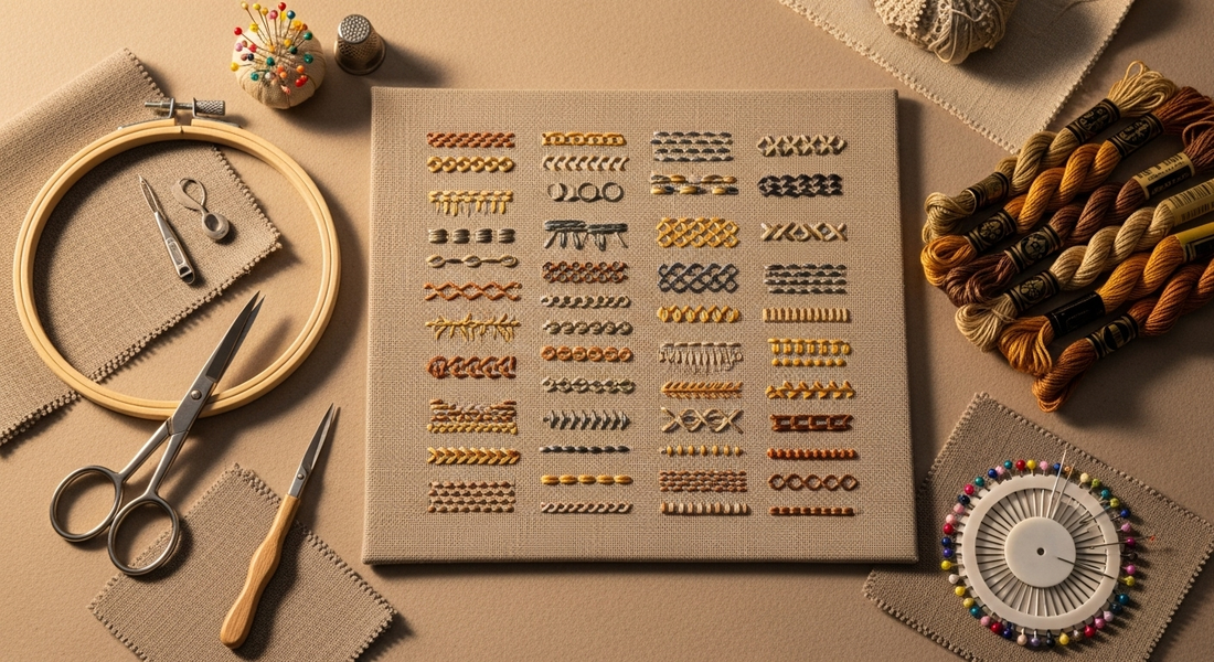
The Big Three That Do Most of the Work
Satin Stitch – The Smooth Operator This is your go-to for anything that needs to look clean and professional. Letters, borders, outlines – satin stitch gives you that smooth, shiny finish that looks polished. But here's the catch: it's picky about size. Try to make it too wide and it'll loop and look messy. I learned this when I tried to satin stitch a 15mm wide border and ended up with something that looked like it was made of rope.
The trick is keeping it under 12mm wide. For curves, shorter stitches work better – they follow the line more smoothly instead of creating those sharp angles that scream "machine made."
Fill Stitch – The Workhorse When you need to cover a large area, fill stitch is your friend. It's basically rows of stitches that fill in shapes, kind of like coloring with thread. I use this for logo backgrounds, patches, anywhere I need solid color coverage.
The key thing I learned about fill stitch is that the angle matters. If you do all your rows in the same direction, you can end up with fabric that pulls and distorts. I started varying the angles and adding underlay stitches underneath for stability. Game changer.
Running Stitch – The Detail Master This is just a simple line of stitching, but don't underestimate it. It's perfect for fine details, outlines, or when you want that hand-stitched look. I love using running stitch for sketch-style designs where you want it to look like someone drew with thread.
You can also double it back on itself for a bolder line. I do this when I want something more prominent than a single line but not as heavy as satin stitch.

The Specialty Players
Bean Stitch – The Reinforcer This goes over the same line three times, so it's thicker and more pronounced than running stitch. I use it for bold outlines or when I need something really durable. It's great for kids' clothes that are going to get beaten up in the wash.
Motif Stitch – The Texture Creator This one repeats little patterns like stars or flowers across a line or area. I don't use it often, but when I want to add texture or visual interest to a decorative piece, it's perfect.
The Fabric Factor
Here's something I wish I'd understood earlier: different fabrics need different approaches. That cotton shirt that worked perfectly with satin stitch? Try the same settings on a stretchy knit and you'll get puckering and distortion.
Lightweight knits need gentler treatment – running stitch or satin with good underlay. Denim can handle heavier stitches like fill and bean stitch. Towels and fleece need special considerations because of their texture.
I keep notes on what works with different fabrics now. It's boring, but it saves me from repeating mistakes.
The Lettering Lesson
Text is where stitch choice really makes or breaks a design. I used to default to satin stitch for everything, but that polo shirt disaster taught me otherwise.
For clear, bold letters, satin stitch is great – if the letters are big enough. For small text under 5mm, I use running or bean stitch. Fill stitch on tiny fonts is a recipe for disaster. It just looks like a mess of thread.
I always test fonts on the actual fabric now. What looks good on screen might be completely unreadable when stitched out.
Direction and Order Actually Matter
This is something I ignored for way too long. Not just what stitch you use, but which direction you stitch it and in what order can completely change how your design looks and how your fabric behaves.
I learned this when I was working on a design with multiple elements. I'd randomly assigned stitch directions, and the fabric was pulling in different ways, creating this weird warped effect. Now I plan out stitch directions to balance the pull across the fabric.
Your digitizing software can help with this – grouping similar stitch types together so the machine doesn't have to keep switching back and forth. It makes everything run smoother and faster.
My Current Approach
These days, I think about stitch type before I even start digitizing. I'll look at each element and ask: What needs to stand out? What needs to be durable? What's the fabric going to handle well?
Text gets satin stitch if it's big enough, running or bean if it's small. Large areas get fill stitch with careful attention to angles. Fine details get running stitch. Borders and outlines usually get satin stitch.
But the real test is always the stitch-out. I've learned to do small test sections, especially when I'm trying something new or working with unfamiliar fabric.
What I Wish I'd Known
Stitch type choice isn't just about aesthetics – it's about function. A beautiful design that causes fabric distortion or is illegible isn't actually beautiful at all.
Also, there's no one "right" stitch type for any given element. It depends on size, fabric, intended use, and what effect you're going for. The key is understanding what each stitch type does well and what its limitations are.
And here's the thing nobody tells you: you'll still make mistakes. I still occasionally use the wrong stitch type and have to redo things. But now I catch them faster and know how to fix them.
The goal isn't perfection – it's understanding your tools well enough to make good choices most of the time. And when you do get it right, when the stitch type perfectly matches the element and the fabric and everything just works together seamlessly, it's incredibly satisfying.
That's when embroidery stops being about following rules and starts being about creating something that's both beautiful and functional.